 Blog
Blog

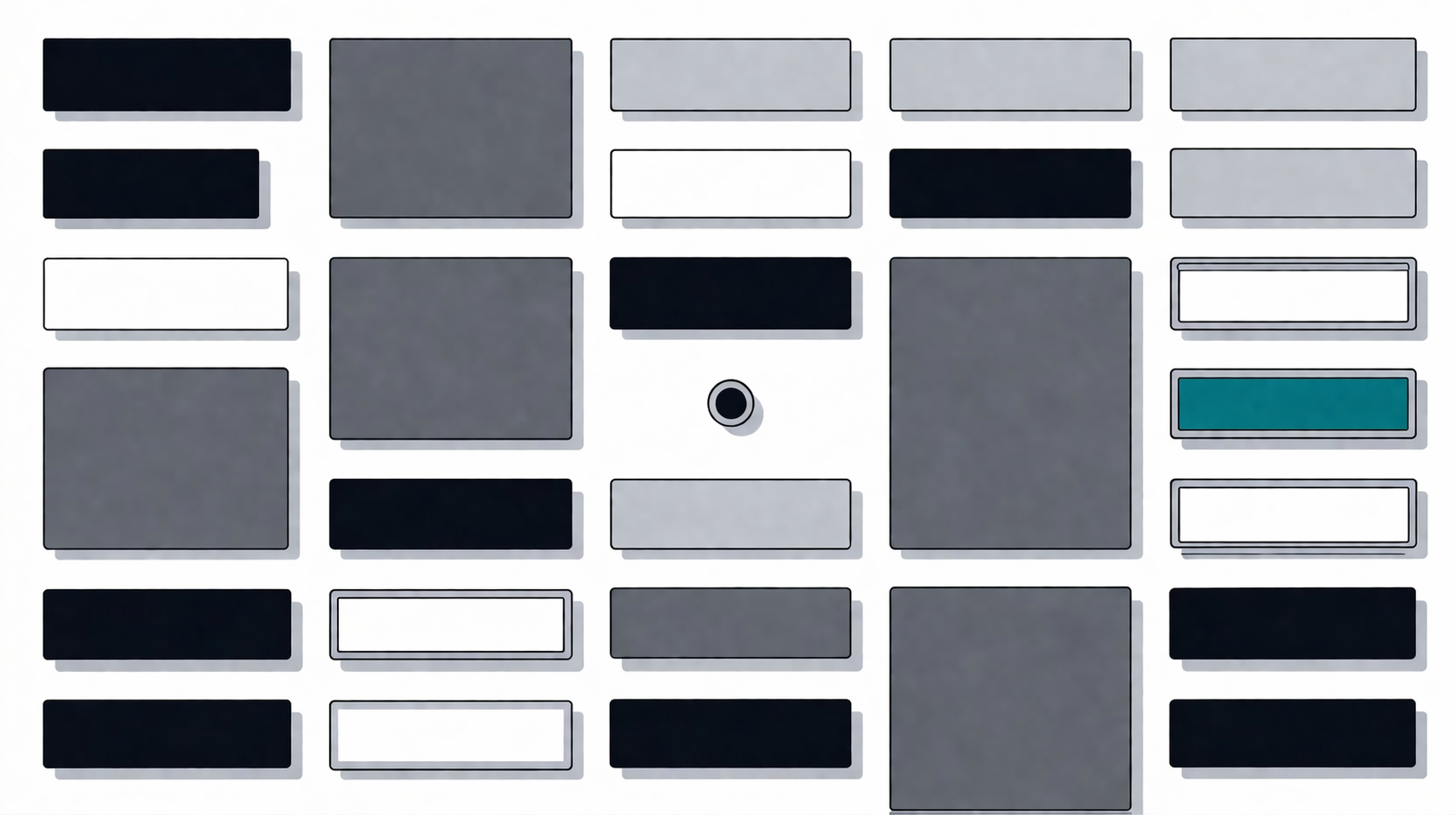
“Should the card have 4px or 8px border-radius?”
It was a 47-minute thread. Four engineers, two designers, one Figma file with six variants. The discussion covered iOS conventions, Material Design guidelines, optical alignment, and at one point, the golden ratio. Nobody was wrong. That was the problem.
We’d been here before. Not just with border-radius — with gradient directions, shadow blur values, opacity levels for disabled states. Each decision was small. Each debate was reasonable. And collectively, they were eating our velocity alive.
So we stopped trying to find the right answer. We removed the question.
The Cost of Options
Every visual property in a design system is a decision surface. Border-radius alone generates questions: Should buttons and cards use the same value? What about nested elements — does the inner radius subtract the outer? Does the radius change at different sizes?
None of these questions are hard. That’s what makes them dangerous. They’re easy enough that everyone has an opinion, but low-stakes enough that no opinion is demonstrably better. Classic bikeshedding.
We manually tagged PR comments over a quarter. Roughly 30% of our design-system review threads were about cosmetic values that had no impact on usability. Not layout. Not accessibility. Not interaction patterns. Just… aesthetics.
That’s when we wrote the rules.
Why Eliminate Instead of Constrain
The obvious alternative is to keep the properties but limit them. Most mature design systems do this — three allowed border-radius values, a shadow elevation scale, a curated gradient palette. We considered it.
The problem is that constrained options still generate debates. “Should this card use radius-sm or radius-md?” is the same conversation with fewer answers. Fewer is better than many, but zero is better than fewer. Constraining a property reduces decisions. Eliminating it removes the decision entirely.
We also looked at linting — an ESLint rule that rejects unauthorized values. But a linter that enforces “only use 0, 4, or 8px radius” still leaves three choices. The goal wasn’t to make the decision easier. It was to make it unnecessary.
Four Rules
Beaket’s component library has four visual constraints:
- No border-radius. Sharp corners on everything. Buttons, cards, inputs, dialogs, tooltips — all rectangular.
- No gradients. Flat colors only. Every surface is a single CSS variable.
- No blur shadows. No
box-shadowwith blur radius. Offset shadows only. - No decorative opacity. Disabled states use color changes, not transparency. No
opacity: 0.5shortcuts.
These aren’t guidelines. They’re hard rules, enforced in code review and documented in our component guidelines. A PR that adds rounded-md gets rejected.
Why these four properties specifically? Because they were the ones generating the most debate with the least usability impact. Spacing and typography affect readability. Color affects meaning. But the difference between 4px and 8px border-radius? Between a 4px blur shadow and a 6px one? We could not find a single case where those choices measurably affected how well someone used the product.
After adopting the rules, our design-system PRs started moving faster. Review threads got shorter. Designers stopped producing multiple variants of the same component differing only in corner treatment or shadow depth. The debates didn’t decrease — they disappeared.
What We Use Instead
Removing options doesn’t mean removing visual hierarchy. You still need to communicate depth, state, and interaction. Here’s how we replaced each property.
Offset Shadows Instead of Blur
Instead of box-shadow: 0 4px 6px rgba(0,0,0,0.1), we use hard-offset shadows defined as CSS variables:
--shadow-offset: 1px 1px 0px 0px var(--color-chrome);
--shadow-offset-hover: 2px 2px 0px 0px var(--color-chrome);
--shadow-offset-active: 0px 0px 0px 0px var(--color-chrome);
Three interaction states. Zero blur. That’s the entire shadow system.
The default state has a 1px offset — the element sits slightly above the surface. Hover pushes it to 2px — a subtle lift. Active snaps it to 0px — the element presses flat. It’s a small, mechanical animation that communicates interaction clearly and leaves nothing for a developer to configure.
In practice, every interactive component applies the same three tokens. Here’s the base of our button component (simplified from the full CVA string, which also includes disabled and focus states):
const buttonVariants = cva(
  [
    "inline-flex items-center justify-center gap-2",
    "font-medium cursor-pointer",
    "shadow-offset hover:shadow-offset-hover active:shadow-offset-active",
    "transition-shadow duration-100",
    // ... disabled, focus-visible, and icon styles
  ].join(" "),
  // ... variants
);
No decisions about which shadow level a component “deserves.”
Flat Colors Through CSS Variables
Our color palette — we call it “Porcelain” — has 14 neutrals ranging from graphite (#030509) to paper (#ffffff). They’re cold and blue-tinted. The theme description in our docs says: “Industrial precision. Etched on control panels in black synthetic lacquer. Pure white, cold blue-black ink, ghostly shadows, teal accent.”
Every color reference goes through a semantic token:
--color-text-primary: var(--color-graphite);
--color-text-secondary: var(--color-steel);
--color-bg-primary: var(--color-paper);
--color-border-default: var(--color-chrome);
We avoid Tailwind color defaults like bg-white or text-gray-500. Every color is a named variable, and every variable maps to a role. Nobody debates whether something should be gray-100 or gray-200 — the semantic token already answers the question.
Sharp Corners Everywhere
This one needs no replacement. You just… don’t add border-radius.
What surprised us is how well sharp corners interact with offset shadows. A rounded card with an offset shadow looks odd — the shadow’s hard edge clashes with the soft corner. But a sharp card with an offset shadow looks intentional. The geometry is consistent. The constraints reinforce each other in ways we didn’t fully anticipate.
The visual language becomes consistent by subtraction. When everything is sharp, nothing needs to justify its shape.
Where Constraints Compound
The sharpest benefit of this approach shows up in cross-cutting concerns — the patterns that touch every component.
Disabled states are notoriously inconsistent across component libraries. Some use opacity, some change the background, some do both. We have one pattern, applied to every component:
disabled:shadow-none disabled:cursor-not-allowed disabled:border-dashed disabled:border-chrome disabled:bg-frost disabled:text-steelButtons, inputs, selects, checkboxes, switches — all identical. Shadow removed (the interactive affordance disappears), dashed border, frost background, steel text. When you’ve seen one disabled component, you’ve seen them all. The constraints removed the temptation to make disabled states “fit” each component’s visual personality. When components don’t have visual personality, disabled states converge naturally.
Focus rings work the same way. Every focusable component uses:
focus-visible:outline-2 focus-visible:outline-signal-blue focus-visible:outline-offset-2One color. One width. One offset. A keyboard user navigating through a form sees the exact same ring on every element. No component overrides it. No variant removes it. Combined with the uniform disabled pattern, a user always knows exactly what “inactive” and “focused” look like — regardless of which component they’re interacting with.
The One Exception
Radio buttons use rounded-full.
That’s it. That’s the only exception in the entire component library. It’s documented in our component guidelines alongside the rules it breaks, because even exceptions should be decisions, not accidents.
A square radio button would confuse users. The circular shape is so deeply embedded in interface conventions that removing it would sacrifice usability for aesthetic purity. We decided that was a bad trade.
You might ask: if usability justifies an exception for radios, why not for avatars, tags, or toggle switches? We tested it. Square avatars with offset shadows look like profile cards — they read as intentional. Tags and toggles are less convention-bound than radio buttons. The circle affordance is uniquely strong for radios; nothing else cleared the bar.
The goal was never “brutalism for its own sake.” It was removing visual decisions that don’t earn their complexity. A rounded radio button earns its shape. A rounded card does not.
What This Actually Costs
We’d be dishonest if we said this approach has no downsides. It does.
“It looks unfinished.” That’s a real reaction from user testing. Sharp corners and flat colors don’t signal the same polish that rounded, shadowed interfaces do. We’ve had to explain the reasoning more than once.
Some components feel rigid. Tooltips and popovers, in particular, look heavier with sharp corners. Blur shadows exist for a reason — they create a sense of floating that offset shadows don’t quite replicate.
Third-party components break the pattern. Date pickers, rich text editors, charting libraries — they all ship with border-radius and blur shadows baked in. We override what we can and accept some inconsistency at the edges. This is an ongoing tension, not a solved problem.
Designer expression is constrained. If you’re the kind of designer who finds joy in crafting micro-interactions with gradient overlays and subtle depth, this system will feel limiting. That’s the point — but it’s still a real cost to creative satisfaction.
It’s polarizing. Some engineers love the simplicity. Others think it’s dogmatic. We haven’t fully resolved this tension. We just decided the consistency benefit outweighs the aesthetic cost for our product.
What We Don’t Know Yet
We haven’t tested this system at true scale — hundreds of components, data-dense interfaces, third-party integrations that need to look native. Tables, charts, and dashboards might need depth cues that offset shadows can’t provide.
We’re genuinely uncertain whether users develop the same intuitive understanding of our shadow states (default → hover → active) that they have with conventional elevation systems. We haven’t observed usability regressions, but we haven’t conducted formal A/B testing on this specifically. It’s working so far. But “so far” is a small sample.
Constraints as Decisions
Every constraint in this system is a decision made once so it doesn’t need to be made again. No border-radius isn’t an aesthetic preference — it’s an ADR (Architecture Decision Record) for the entire component library.
If your team spends time debating visual properties that don’t affect usability, consider removing the option entirely. You might miss it less than you think.